03
Typography & Production Standards
Production Design · Typography · Creative Systems
Partner letters have to hold together through proofing, variable data and print. This project sets the paragraph styles and production rules used to typeset those letters.
The letter
The before letter is markup without paragraph styles applied. It carries crop marks, window specs and uneven type. The revised letter uses one hierarchy for the heading, benefits, callout and legal copy.
The system
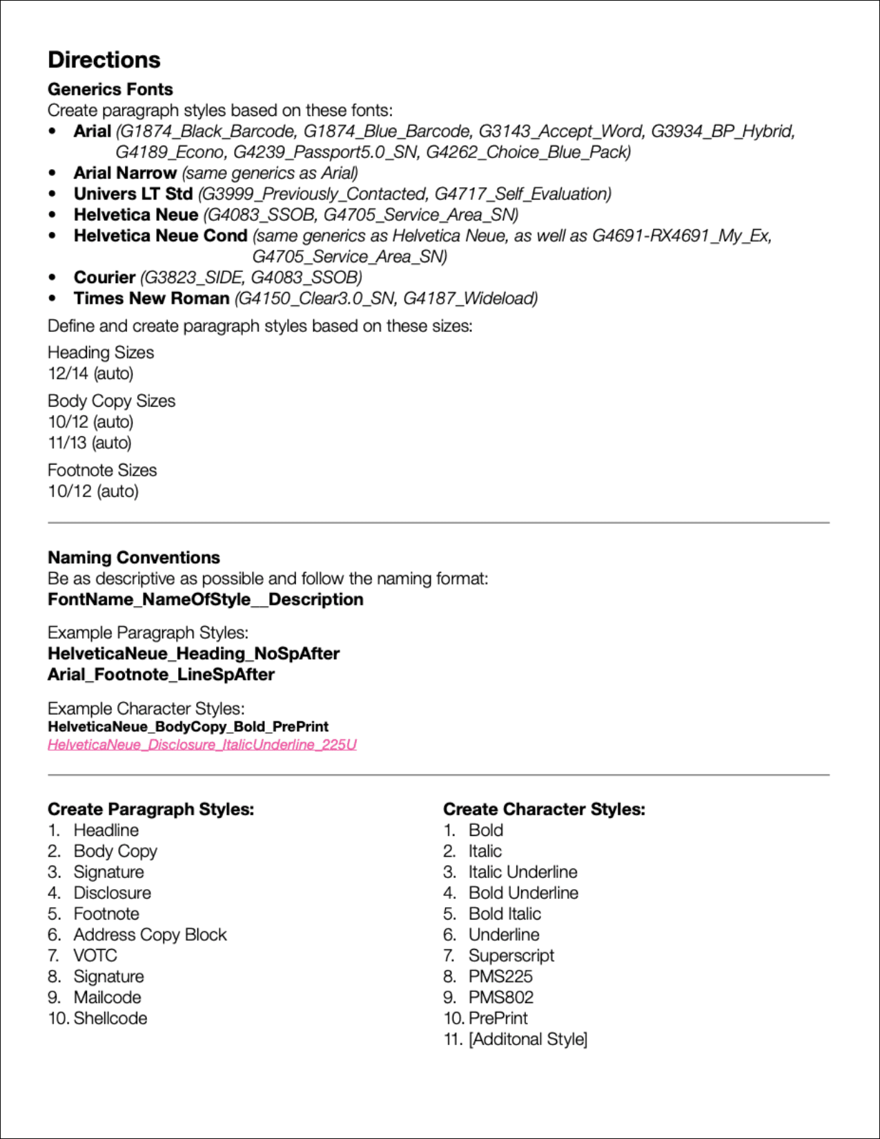
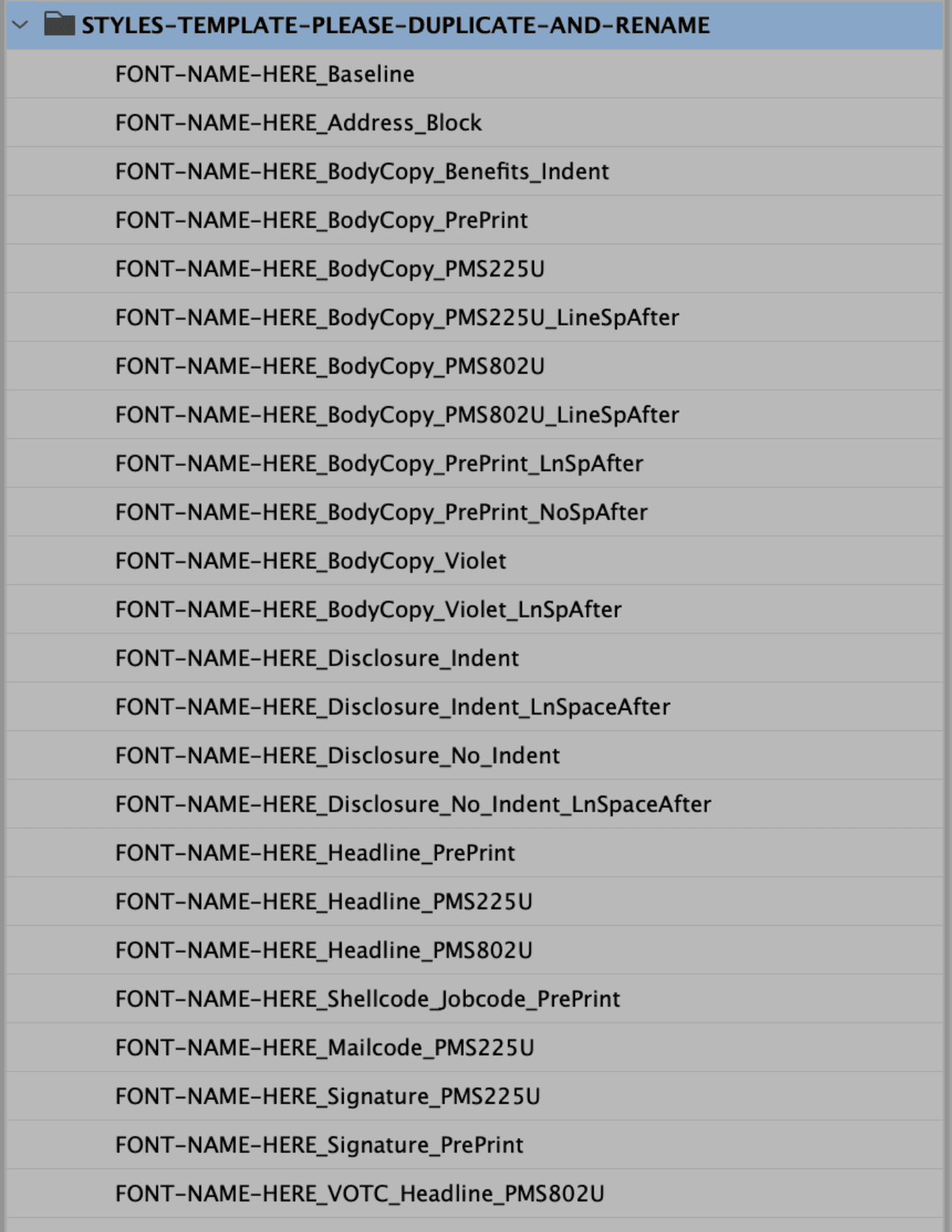
A directions file specifies fonts, sizes and a naming pattern. The matching InDesign style set turns those rules into paragraph and character styles, including production colors.
Making the System Easy to Adopt
To introduce the framework to the team, I used a simple analogy: content is the water; paragraph styles are the containers. The content remains the same, while the style determines its visual structure and purpose.
Content → Style → Consistent Output
This helped translate a technical production concept into an approachable model designers could apply consistently.
The procedure
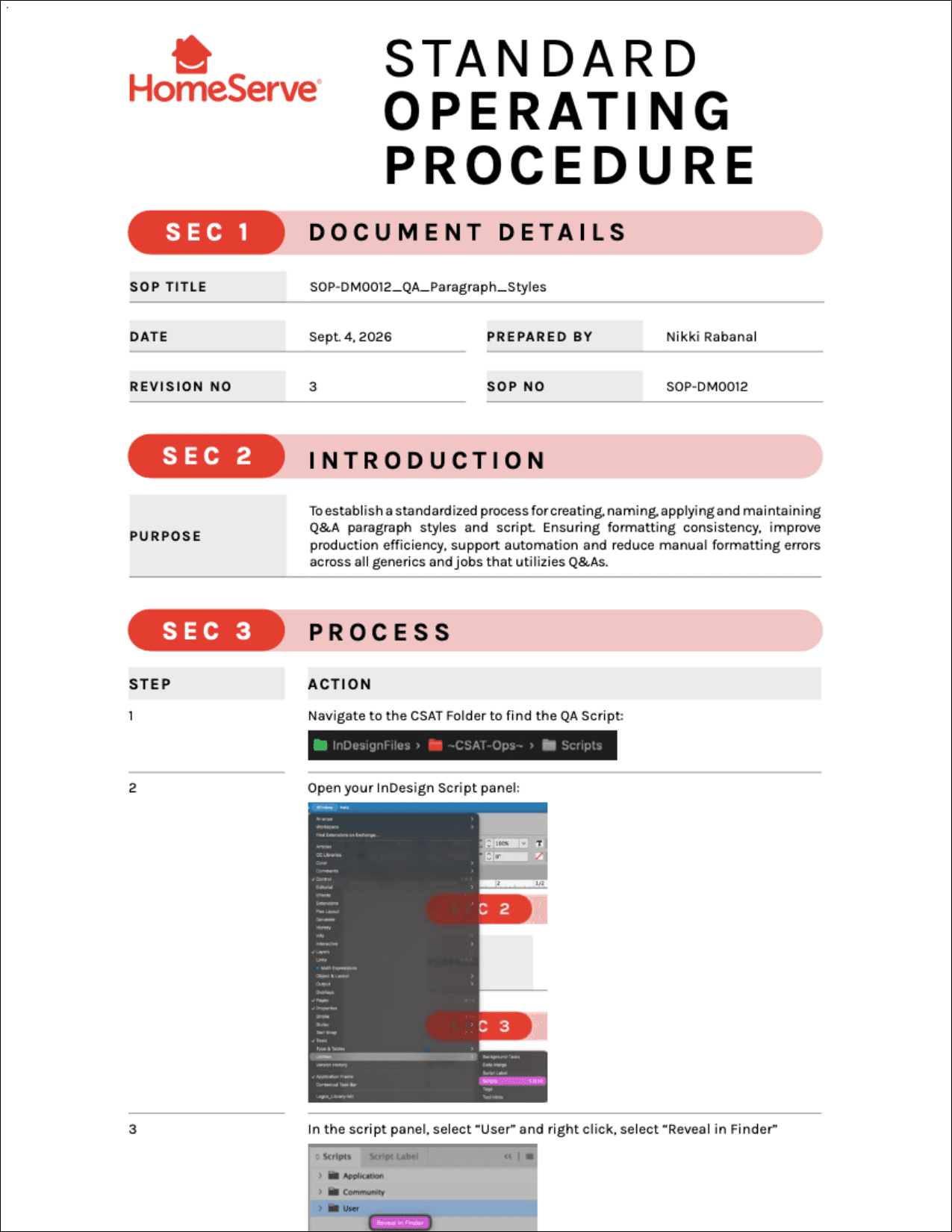
A standard operating procedure records how to create and maintain the styles and the related InDesign scripts.
Documenting for Consistency
To support continued use of the system, I documented the process for creating, naming, applying and maintaining paragraph styles and the associated QA workflow. This created a shared reference for designers and helped make the standards easier to maintain beyond individual files.